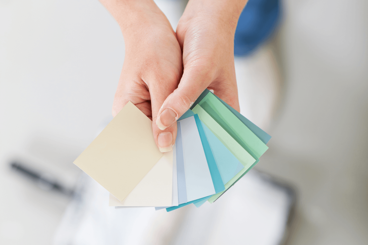
Does yellow make you feel lively and alert — or does it make you anxious and scatter-brained? Do you feel relaxed in a blue room but energized when you’re surrounded by orange? Does red make you feel creative or agitated? Does gray soothe you or make you feel a little down?
None of this is in your mind — but it is hard-wired in your brain. While individual responses to specific colors can vary, color theory and the use of color is an ever-expanding field of study for neurological researchers, marketing pros and efficiency experts (and more). Color theory is also increasingly being used in interior design.
Colors Really Do Influence Human Perceptions and Behavior
For example, bright red is used all over the globe on street signs to attract attention and convey danger, primarily because human brains are geared to respond strongly to that shade. Meanwhile, black is almost universally used to convey power, strength and authority — which is why it is favored for business suits and the uniforms of elite forces.
In fact, color can influence not only our reactions and our moods, but even how we perceive the temperature in a room (rooms painted in warm coolers feel subjectively warmer to people than rooms painted in cool tones even when the temperature is objectively the same in both rooms).
How do you translate all this information into good choices when you’re painting your home’s interior? If you don’t want to stick to basic “relocation beige” on your walls, you’ve got a lot of choices out there — but we have a few suggestions that can make it easier:
Entranceways
You can take two different approaches here: Your entranceway can be a buffer between the world and the real you, or it can set the tone for your entire dwelling.
If you prefer the former, pick a neutral gray, cream or off-white. All of these take a minimalist approach, and the white shades can make a small space feel more open and spacious. None of them will really convey your personality or create a specific mood — but they will create a sense of formality. If you’re a private person who only lets a few people into your home, these could all be good choices.
In contrast, non-neutral colors can help you “announce” the general tenor of your home. Is your home the “hot spot” where your friends all gather? Do you enjoy company and like to keep things lively? Consider warm colors like reds and oranges. Both are known to promote enthusiasm, raise energy levels and stimulate excitement.
In contrast, if you prefer to think of your home as a retreat from the world where everything is calm, cool, and serene, consider cool colors in shades of green or blue. Both are stress-free, natural colors that evoke peace and serenity.
Living Rooms
In most homes, living rooms are the family gathering spot, so you need to pick your colors carefully and make sure they have the right vibe for your family.
If you want the living room to encourage people to sit down and read a book or spend some quiet time together, definitely gravitate toward cool tones. In paler tones, purple encourages relaxation, while dark purples convey a sophisticated elegance, but blue and green are equally soothing.
Want your living room to inspire group activities and lots of energy? Go with a warm color, like red — or even orange. Yellow shades also communicate joy and happiness, so a buttery yellow or goldenrod can add an excellent sense of warmth to your living room. (Do note, however, that both yellow and orange tend to be disliked by a lot of people, so don’t pick these colors if you plan to sell your home soon.)
Dining Rooms
Skip the blues, blacks and purples for this space in your home — no matter how much you like them. Those colors are associated in some primeval part of our minds with danger because only a very few food items come in those colors naturally. Walls in these colors can make good food seem unappealing.
Green is an excellent choice for dining rooms because people automatically associate green with both abundance and health — and that’s a nice message when you’re sitting down to eat. It’s also an increasingly popular color for interior design as people seek to create a private oasis within their homes that will shut out the rest of the world.
If you really want guests to dig in and enjoy their food, however, go with a shade of red or yellow on the dining room walls. (There’s a reason so many fast food joints use those colors in their signs and decor.)
Bedrooms
Most of the best colors to use for a bedroom fall on the “cool” spectrum. Green has been described as the “most restful” color to use, but blue will lower your blood pressure after a long hard day.
If you’re going for comfort and warmth, consider drifting toward a neutral palette that’s full of rich browns. That can turn your bedroom into an elegant room that makes relaxation easy.
Kitchens and Home Offices
We grouped these two together because a lot of people convert their kitchen tables into improvised office spaces when they need to work from home or study areas for the kids during the school year.
Blue is supposed to be the most productive color, while green boosts concentration — both of which can be helpful whether you’re working or cooking. Do note, however, that neither of these colors is known to spark creativity. If you like to be experimental with your cuisine or you work in the arts, consider orange or red to keep those creative juices flowing.
Ultimately, when you’re choosing, make sure that you’re happy with the choice. Spend some time thinking about how each color makes you feel, and choose your color palettes accordingly.


