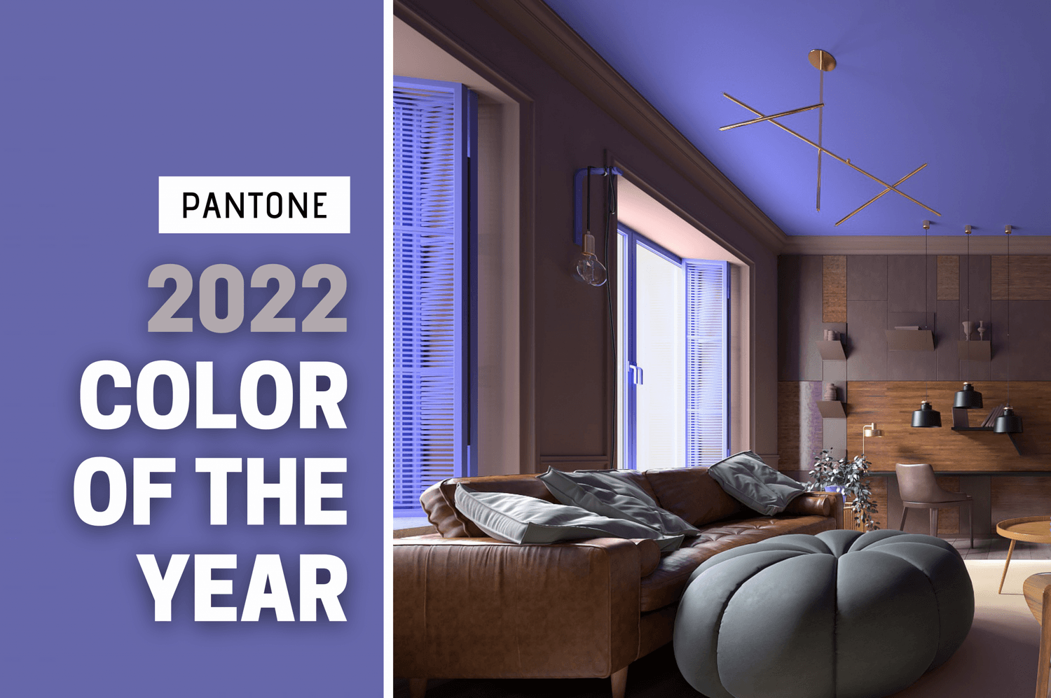
Well, they did it again: The Pantone Color Institute just made history.
In 2021, Pantone surprised everybody by selecting not one but two colors of the year, giving both Illuminating Yellow and Ultimate Gray the nod. This year, the Institute has made history once again by actually creating a brand new color to reflect the mood of 2022. Its name is “Very Peri.”
What’s So Special About Very Peri and Why Did Pantone Pick It?
Very Peri (or PANTONE 17-3938) is a shade that’s divergent from the soothing, natural hue called “Evergreen Fog,” chosen by Sherwin-Williams for its Color of the Year in 2022.
Evergreen Fog, which has been described as a cross between olive green and sage, was selected based on visible trends that show consumers gravitating toward warm, earthy neutrals that go well with organic decor elements. It’s a color that represents stability, steady growth, and a basic human need to remain connected to nature.
By comparison, Very Peri couldn’t be more different in looks, feel, or intentions.
A lively (slightly surreal) blend of blues with red-violet undertones, Very Peri is a dynamic color that is designed to symbolize both the transformative experience of the last year or two and the changes still to come as the real world and the digital world becomes ever more deeply intertwined in the metaverse.
In the words coming from Pantone, “Very Peri illustrates the fusion of modern life and how color trends in the digital world are being manifested in the physical world and vice versa.” Lively and unique, Veri Peri represents “courageous creativity and imaginative expression.”
The fact that it’s brand new is a reminder that the world is about to change – again – in ways that we’re only just starting to appreciate. It encourages us all to embrace the future and find new joys and outlets for whatever is innovative, experimental, or just plain extraordinary.
How Can You Incorporate Very Peri Into Your Home’s Decor?
This might get a little tricky. Because there’s nothing neutral at all about Very Peri, it would be a bold choice to use it on a large project. Those mixed blues and violet undertones probably won’t work well in a kitchen or dining room, and you definitely won’t find them conducive to sleep if you put this shade on your bedroom walls.
So where can you use it? This hue is probably at its best when you make it the star of your show, as an accent piece or pop of color that draws the eye toward it when someone enters a room – although this color does encourage experimentation. With that in mind, here are some suggestions on how to incorporate this color into your home’s decor:
In the Family Game Room
Since this color is meant to make you think of all things digital, why not use it in the room where the digital and reality often meet?
This color automatically creates an atmosphere that feels a bit futuristic, so it won’t seem out of place if you decide to put Very Peri on all four walls – although it might be more attention-grabbing to use it just on the ceiling. Combined with recessed lighting and white walls, a Very Peri ceiling could evoke thoughts of an alien world or a spaceship (which is just ultra-cool in a game room) when you first walk into the room.
Accent Walls with Family Photos
Very Peri would look equally gorgeous next to gold or silver frames, so why not use it on the wall where you hang your family photos?
A lot of people hang collections of family photos together on accent walls in their foyer or hallway. Painting just one wall this particular hue would definitely draw all eyes that way. If you want a wall that truly serves as a showcase, this could be the color that does it.


In Your Home Office
Your home office is another room where the digital world and real life collide, so why not embrace this fusion?
Very Peri is meant to spur folks into creative action, so using this as the color for the wall across from your desk could be particularly useful if your work requires you to be imaginative. Those underlying reds and violets give this shade some real energy, so you won’t find yourself nodding off because it’s just a bit too calm for an office.
In Your Meditation Spot
Do you regularly meditate? Or, do you have a spot where you like to sit while you actively shift and sift through your thoughts as you contemplate your life and future goals? Very Peri might be the perfect color for a wall or ceiling in that area.
This is a color that’s all about transcendence, transformation and change, so it has the perfect vibe for a spot where you do deep thinking.
On Accent Pieces
When Pantone makes its selection for the color of the year, manufacturers take note. It won’t be long before you see this shade on pillows, candles, blankets and other accessory items.
Used judiciously, Very Peri could instantly brighten up a drab room without becoming overwhelming. If you have a room that’s mostly neutral, why not give your space a bit of flair with a few soft throws in this shade of blue and a small accent rug? That way, you are not committing to the color in any big way until you know exactly how it resonates with you.
Very Peri is a unique color for a unique time in human history. If you’re ready to redecorate or remodel part of your home, don’t be afraid to embrace this shade. If it makes you happy, then that’s all that really matters!


